

Trip Planning at Your Fingertips
Many people are passionate about traveling, but trip planning can quickly become too overwhelming. A simple Google search can yield many results, yet we still can’t decide which attractions to put on our planners. Too many options can be paralyzing.
DURATION
3 Months
PROJECT TYPE
Personal Project
MY ROLE
Product Design, User Research, Prototyping, User Testing
Product Proposal
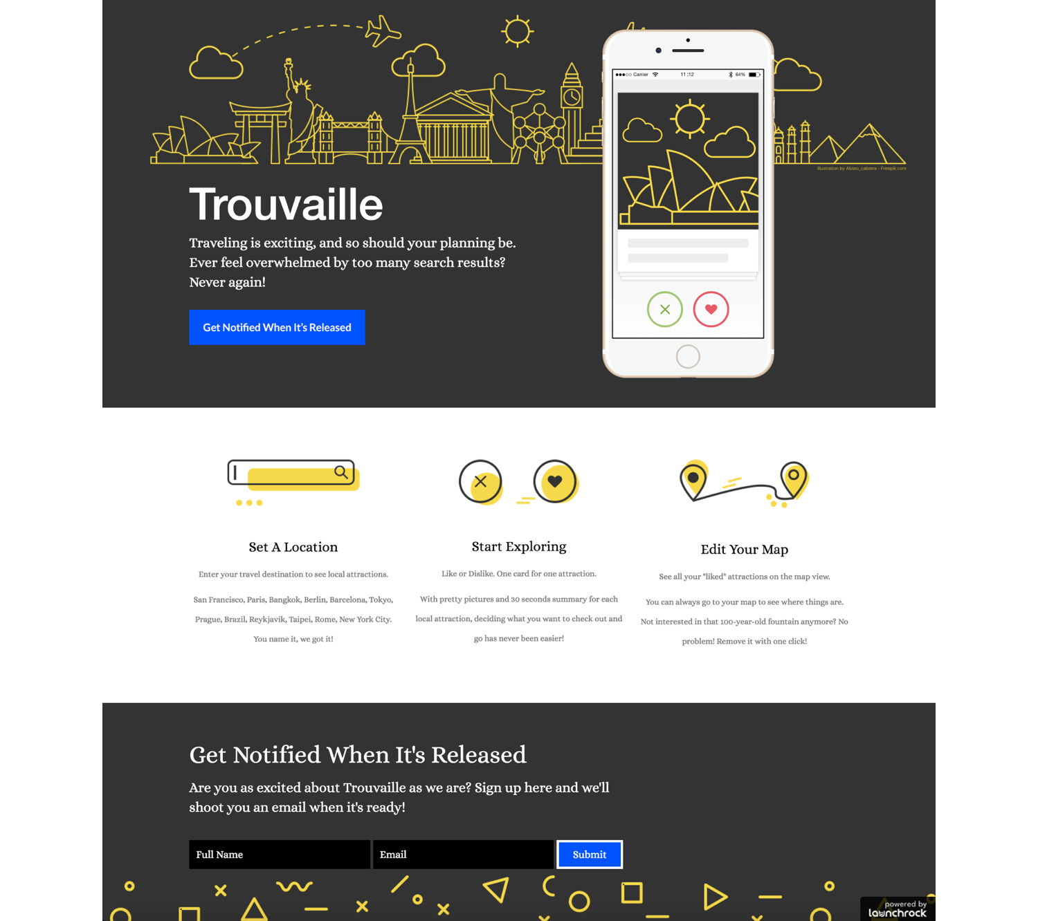
Trouvaille is an attraction searching app that won’t overwhelm users during their trip planning processes. Users no longer need to read articles after articles to find information regarding what to do. Information can now be consumed in bite-size and are presented clearly in map view to show proximity for easier planning.

Swipe Away
Enter your travel destination, select from a list of categories you are most interested in exploring, and start swiping on attractions’ “profiles“.
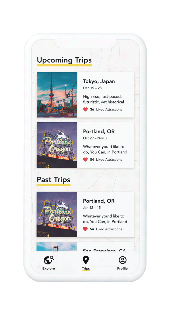
View on Map
You can also see the proximity of your liked attractions in map view to better plan your travel routes anytime.
THE CHALLENGE
“How can we provide sufficient information without overwhelming trip planners?”
Discovery
I am most interested in people who plan their own trips. I started off with some secondary research regarding traveller types and some sites/apps out there that are related to trip planning.

I also recruited 6 people to learn more about how they plan their trips and frustrations they encounter.

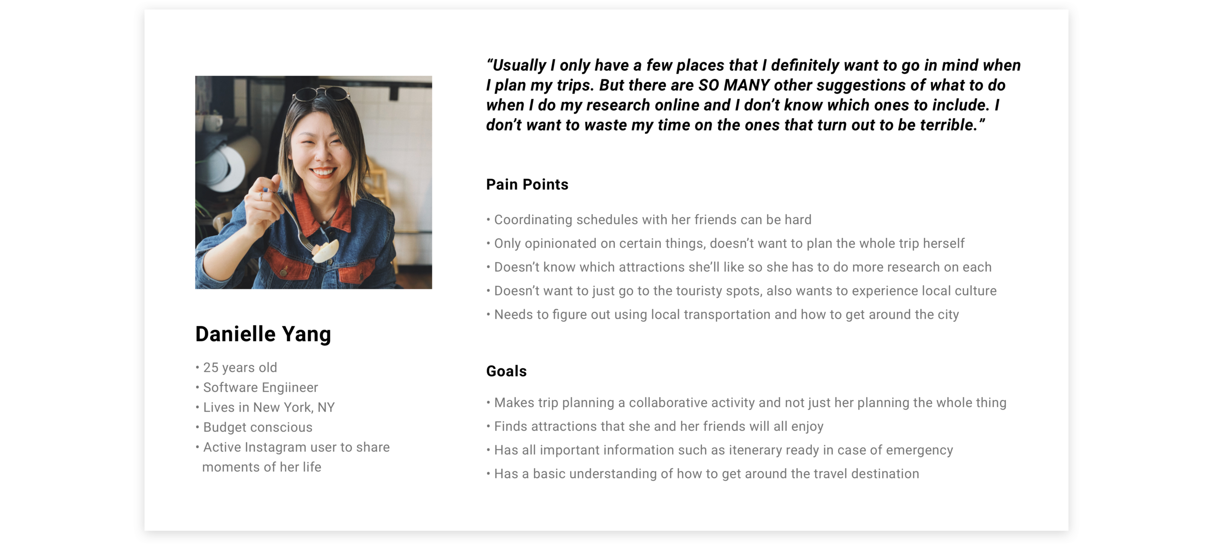
The User

Opportunity
01 NARROWING DOWN
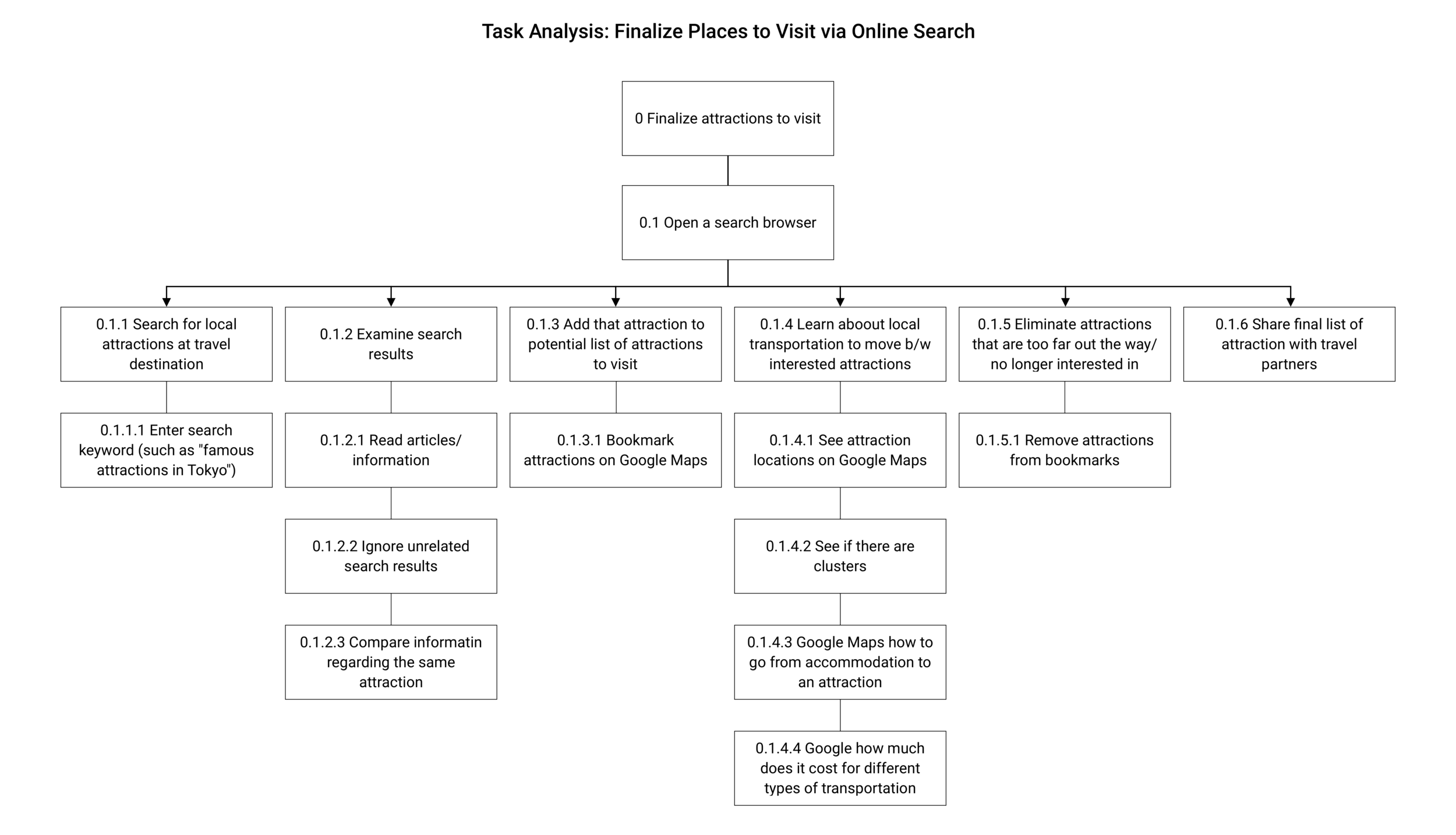
I decided to intervene the search phase because it’s one of the biggest causes of distress in the trip planning process.
Trip planners want to find activities or attractions that they will truly enjoy as they have limited time. However, sorting through the overwhelming amount of information and worrying about the truthfulness of those information can feel paralyzing in decision making process.
02 INSIGHTS

Exploration
I realized from discovery that it’s usually not about how much information to show users, but how to show those information without making them feel overwhelmed. These initial ideas are categorized in 3 clusters:

With a bit of mix and match, the idea of an attraction swiping app emerged. I’m interested in the swiping concept because it gamifies processing information and makes it less stressful.
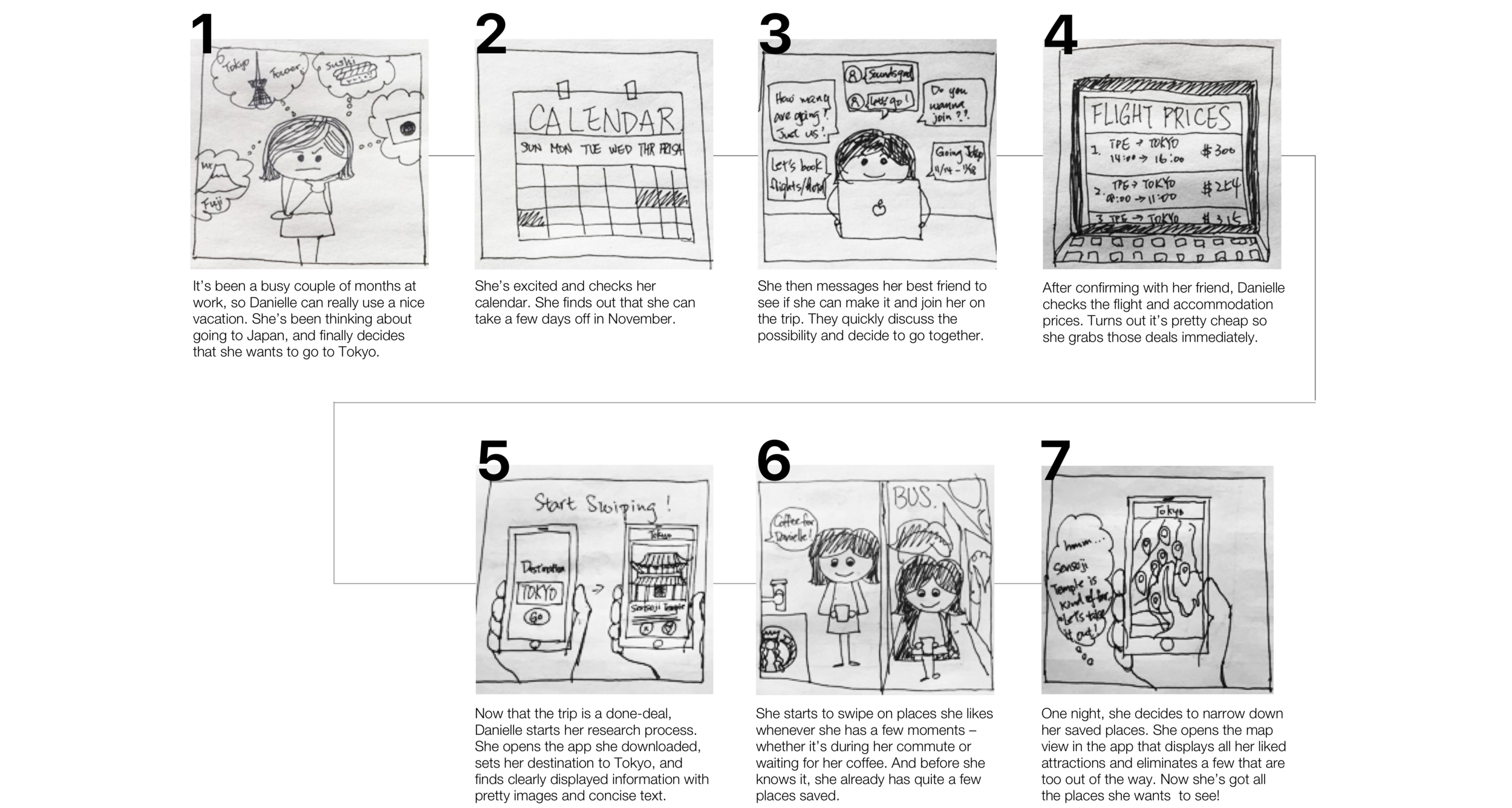
I wanted to first validate if the concept is desirable, so I I created a storyboard to illustrate the process and a landing page to explain the key features to gather feedback.
Concept Feedback

Prototype, Testing, Iterate, Repeat


I tested the prototype I created using the lo-fi screens with 6 users. They all found the app intuitive to use (as they are all familiar with the swiping gesture).
However, half of them raised the point that they might get tired of swiping if they don’t know how many profiles there are to start with and might just end up with way too many results on their maps. While at the moment of swiping they didn’t feel overwhelmed, they might still need to go through the trouble of sorting out the result later on.
To address this issue, I iterated the explore process by introducing categorization before swiping so that the users receive better quality recommendations and have a better scope in mind.

Final Design
The main goal for the app is to reduce overwhelmingness in users’ research processes. To do so, I focus the overall flow of the app on two key things: finding interesting attractions without tedious research process and editing saved attractions easily. By swiping on attraction profiles, the app presents a great amount of information in bite-size. Users can go to the map view at any time to see interested attractions in clusters or proximity on the map to better adjust their plans.

Next Steps
Next steps will be conducting some more testing to challenge my assumptions:
I assume that the swiping mechanism will make people feel less overwhelmed, but should it be a limit to the number of swipes per day or per category? Does swiping on these profiles actually make people feel less overwhelmed? I would like to test this with more users.
Would people care to add interested attraction from previous trips to their future trips?
What information do people care about the most for attraction profiles?
Key Takeaways
Problem Statement:
Having a clear problem statement definitely helped me stay focused in the design process a lot. There are already so many useful tools out there helping people plan their next getaways, it’s very tempting to just look at existing solutions and try to combine them. However, doing so will not only create a product complex product that’s difficult and confusing to use but also stray away from the main pain point I’ve identified.
User Interviews and Testings:
Even though I tried not let my own experiences influence design decisions in the process, it’s inevitable that I made assumptions on how people plan their trips based on personal experiences. Conducting rapid testings throughout the process and early help tremendously to see how people actually interact with the product instead of how I think they will.